
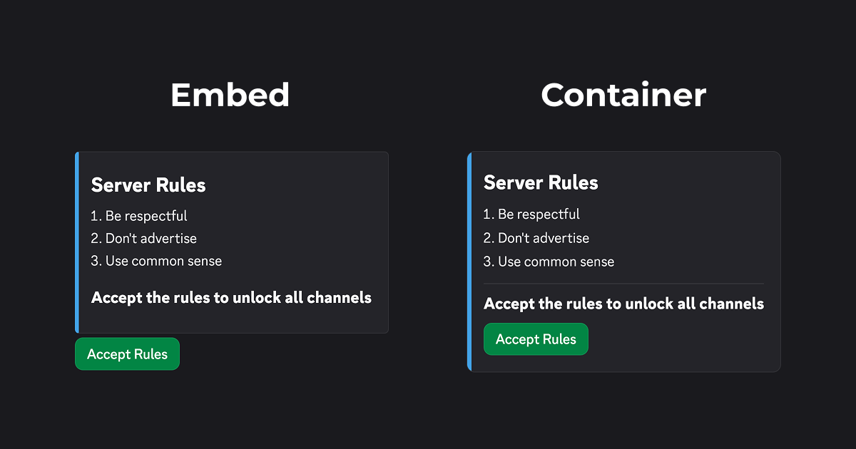
To put buttons inside embeds you have to use a container component with the Components V2 message layout. A container looks just like an embed at first glance but it allows you to put buttons, select menus and other components inside of it.
Differences between embeds and containers
Embeds force you to use their fixed layout (buttons under the embed, images always at the bottom etc.). Containers with Components V2 allow you to build your own layout and can mostly replicate embeds.
| Feature | Embeds | Containers |
|---|---|---|
| Component placement | Under the embed only | Anywhere: above, below and inside |
| Author | Supported | Can be replicated with markdown and emojis:😃 [Author](https://example.com) |
| Title & URL | Supported | Can be replicated with markdown: ## Titleor ## [Title](https://example.com) |
| Fields | Supported | Side-by-side alignment is not possible, otherwise they can be replicated with markdown |
| Footer | Supported | Can be replicated using subtext and emojis: -# 👀 text |
| Timestamp | Supported | Can be replicated using @time |
| Sidebar colour | Supported but default colour not removable | Supported and optional (sidebar has no colour by default) |
| Mentions ping? | Never | Yes, but can be restricted using Allowed Mentions |
Putting buttons in an embed with Discoflow
The Discoflow message builder uses Components V2 so you can add a container component right away. After that add the button inside of it, and configure it to do what you want. You can make the button send a hidden message, add roles to members, create threads and more.
Automatically convert an existing message to Components V2
You can paste your existing message data into our JSON editor. We'll automatically convert the message to Components V2 once you save.
Putting buttons in an embed with code
Set the IS_COMPONENTS_V2 flag (1 << 15) on your message, and add a container component with a button inside of it.
You can use our code generator so you don't have to do this manually.
Example discord.js code
{
  flags: MessageFlags.IsComponentsV2,
  components: [
    new ContainerBuilder()
      .addActionRowComponents(
        new ActionRowBuilder()
          .addComponents(
            new ButtonBuilder()
              .setStyle(ButtonStyle.Primary)
              .setLabel('Button')
              .setCustomId('button')
          )
      )
  ]
}Example JSON code
{
  "flags": 32768, // Use Components V2
  "components": [
    {
      "type": 17, // Container
      "components": [
        {
          "type": 1, // ActionRow
          "components": [
            {
              "type": 2, // Button
              "style": 1,
              "label": "Button",
              "custom_id": "button"
            }
          ]
        }
      ]
    }
  ]
}